The Best and Worst Yard Signs in Maryland
I was driving down Georgia Ave. with my girlfriend over the weekend and we passed a few Gansler signs. (I completely forgot there are a few near the Bank of America at the corner of Spring and Georgia.) She and her roommates have gotten a lot of mailings from local D-16 candidates and one of her roommates has been collecting pieces given out at the Cleveland Park Metro from D.C. candidates. None of them are political junkies like I am, they collect them for my own amusement and they're getting the mailings because they're newly registered - within the last six months - Democrats. Any direct mail and field professional will tell you that you have one chance to get a newly registered voter to be a regular voter, so they're getting more buried than I am.
(For the record, I've only voted in one Maryland election, the 2002 primary. I registered in Providence while I was in school so I'm listed with that weird 2 - - - on the voting list. The Party probably thinks I'm dead... I digress.)
Well, anytime they have a new piece, I critique it with them. We talk about the color scheme, the text layout, the message, the pictures, the manner in which it's addressed - you wouldn't believe the number of mailers addressed to REGISTERED DEMOCRAT that I've seen. I've been fascinated with mail and email since Hal Malchow guest lectured a class of mine.
So, we were driving down Georgia Ave. and my girlfriend sees a Gansler sign and says she thought it was a very attractive sign. She's dead on, the marroon coloring looks great and it really stands out with a lot of the amatuerish stuff I've seen around the County. So, it got me thinking, what are some of the best and worst signs that are getting planted in our neighborhoods?
Let's start with Martin O'Malley, the Democratic candidate for Governor: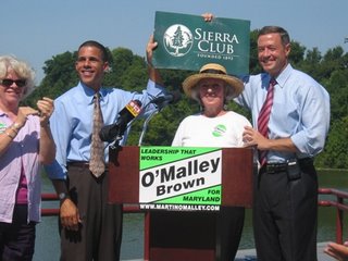 I like the boldness of the green, it grabs your attention. But, it's a little too green and it fades pretty quickly on some of the older stickers, making it look like a leftover from his mayoral campaigns, which used the same logo. The logo may not look fantastic on yard signs and bumper stickers, but it blends fantastically well on mailings and literature.
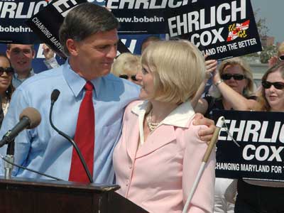
Bob Ehrlich's campaign sign looks great. It looks to be made by the same folks who made the Bush/Cheney logo - bold type face, authoritative colors. While it might look nice on a car, it doesn't catch your eye from a block away. Nor does it brand his candidacy in the manner that the bright green does for O'Malley.
Stu Simms has one of the stranger signs I've seen in a while. Some list his experience, almost like a direct mail piece. I don't like the white space at all but it does tell the message that he is running with - Simply the Best Qualified.
Tom Perez's signs are clean but the blue and yellow looks a little too much like a Michigan Wolverines banner.
None of the local races have blown my socks off with their designs. Dana Beyer has way too much, as does Heather in District 20.
Jeff Waldstreicher's use of dark blue and yellow doesn't have the Michigan feel that Tom Perez and could be one of the cleanest in the County.
The yard sign game is such a crapshoot. I really don't think it shows much, but it grabs the attention of the insiders. The campaign logo, though, is incredibly important. It is the Swoosh that brands a campaign. If it looks like shit on a mailer, its taking away from the message ... and I'll probably focus on the bad quality for 30 minutes during Project Runway at my girlfriend's.
Have nominations? Send a link or a photo file and I'll add your nominated signs to the list ... along with running commentary - mikeraia at gwu dot edu.
Originally posted at Outside the Beltway
(For the record, I've only voted in one Maryland election, the 2002 primary. I registered in Providence while I was in school so I'm listed with that weird 2 - - - on the voting list. The Party probably thinks I'm dead... I digress.)
Well, anytime they have a new piece, I critique it with them. We talk about the color scheme, the text layout, the message, the pictures, the manner in which it's addressed - you wouldn't believe the number of mailers addressed to REGISTERED DEMOCRAT that I've seen. I've been fascinated with mail and email since Hal Malchow guest lectured a class of mine.
So, we were driving down Georgia Ave. and my girlfriend sees a Gansler sign and says she thought it was a very attractive sign. She's dead on, the marroon coloring looks great and it really stands out with a lot of the amatuerish stuff I've seen around the County. So, it got me thinking, what are some of the best and worst signs that are getting planted in our neighborhoods?
Let's start with Martin O'Malley, the Democratic candidate for Governor:
 I like the boldness of the green, it grabs your attention. But, it's a little too green and it fades pretty quickly on some of the older stickers, making it look like a leftover from his mayoral campaigns, which used the same logo. The logo may not look fantastic on yard signs and bumper stickers, but it blends fantastically well on mailings and literature.
Bob Ehrlich's campaign sign looks great.
 It looks to be made by the same folks who made the Bush/Cheney logo - bold type face, authoritative colors. While it might look nice on a car, it doesn't catch your eye from a block away. Nor does it brand his candidacy in the manner that the bright green does for O'Malley.
Stu Simms has one of the stranger signs I've seen in a while. Some list his experience, almost like a direct mail piece. I don't like the white space at all but it does tell the message that he is running with - Simply the Best Qualified.
Tom Perez's signs are clean but the blue and yellow looks a little too much like a Michigan Wolverines banner.
None of the local races have blown my socks off with their designs. Dana Beyer has way too much, as does Heather in District 20.

Jeff Waldstreicher's use of dark blue and yellow doesn't have the Michigan feel that Tom Perez and could be one of the cleanest in the County.
The yard sign game is such a crapshoot. I really don't think it shows much, but it grabs the attention of the insiders. The campaign logo, though, is incredibly important. It is the Swoosh that brands a campaign. If it looks like shit on a mailer, its taking away from the message ... and I'll probably focus on the bad quality for 30 minutes during Project Runway at my girlfriend's.
Have nominations? Send a link or a photo file and I'll add your nominated signs to the list ... along with running commentary - mikeraia at gwu dot edu.
Originally posted at Outside the Beltway
posted by Anonymous at 4:26 PM
![]()
![]()


0 Comments:
Post a Comment
<< Home